Air Canada Annual Report - Redesign
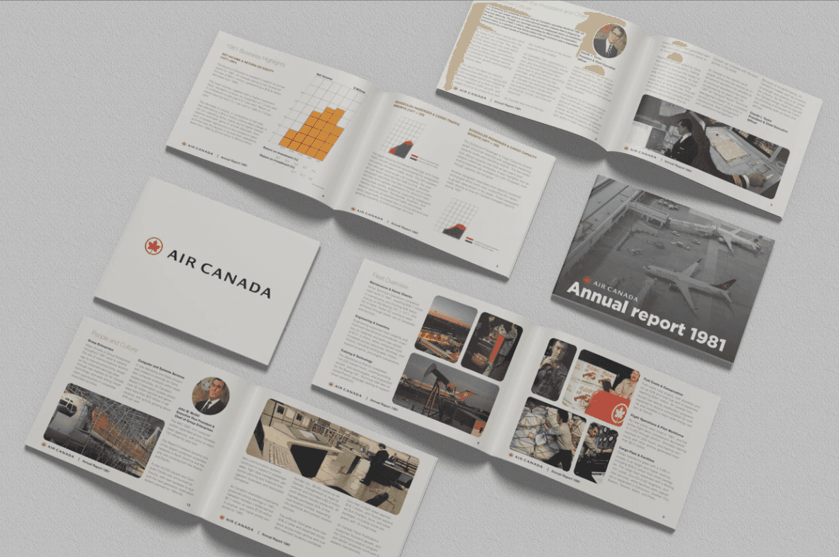
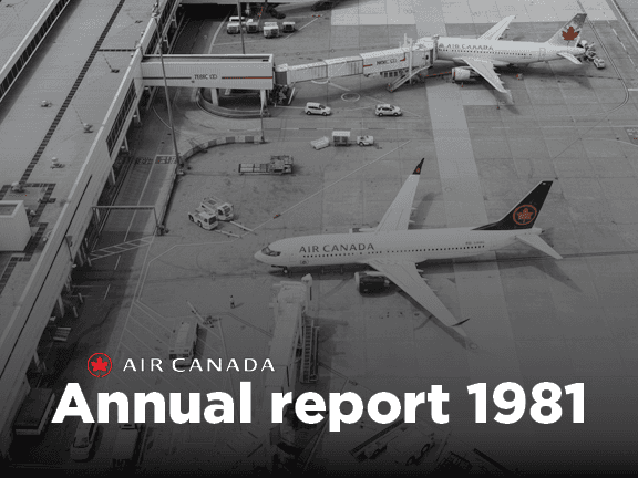
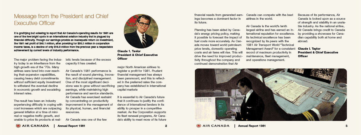
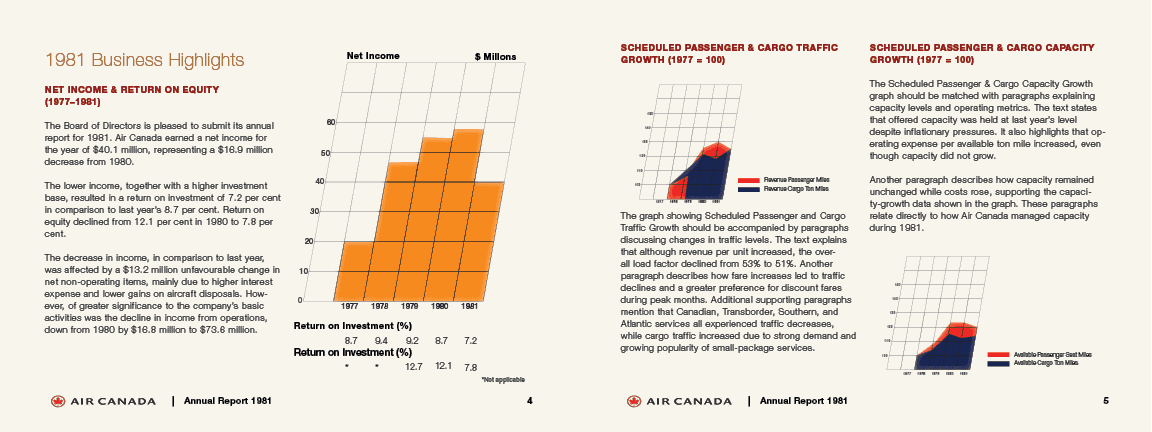
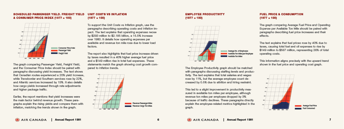
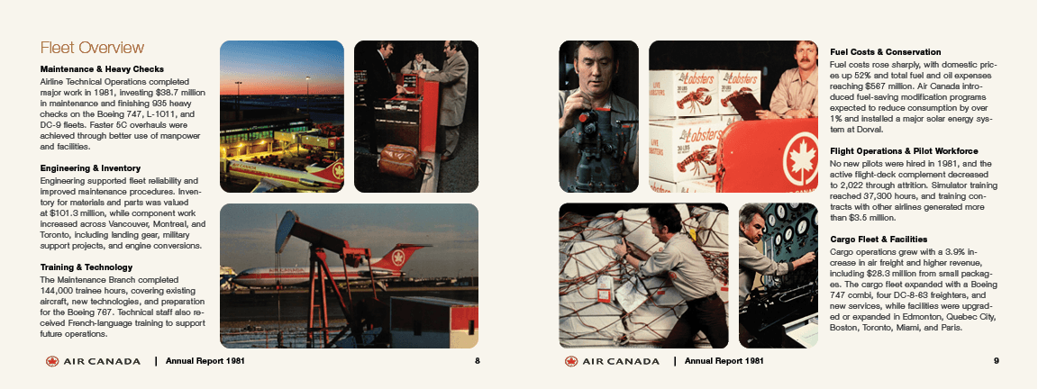
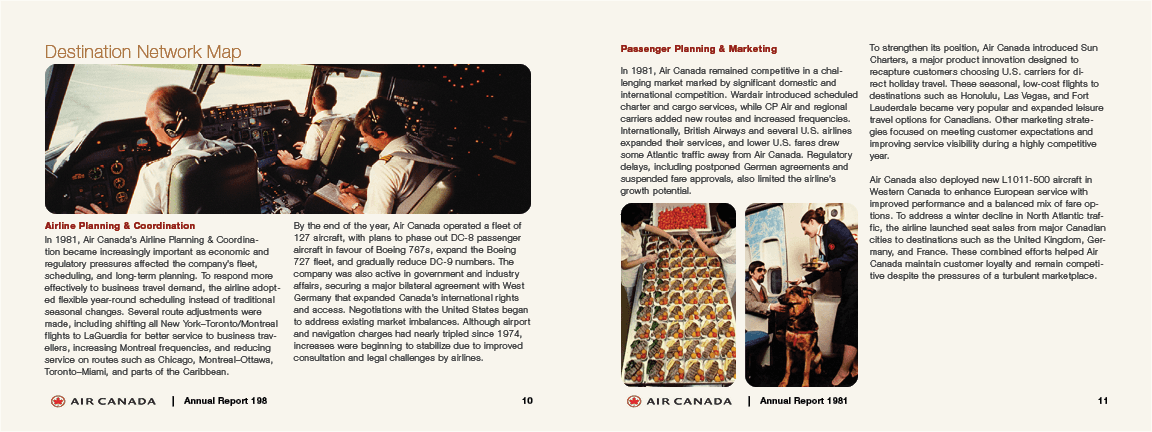
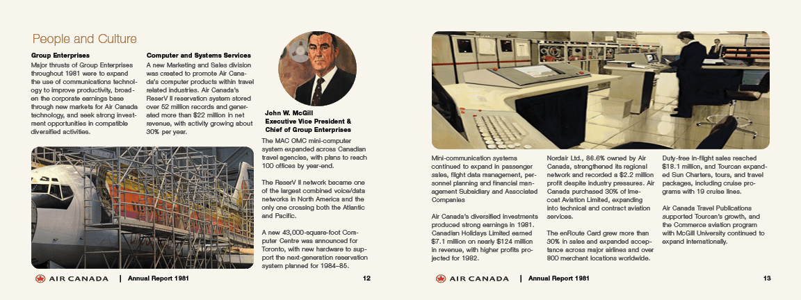
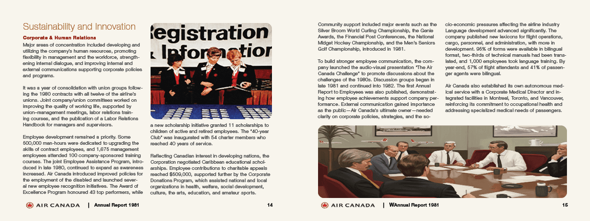
This project started with Air Canada's original 1981 annual report a dense, text-heavy document that was hard to read and visually outdated. My job was to take the same content and completely reimagine it, first as a redesigned print layout and then as a fully designed web page in Figma. The print side was challenging because I had to respect the original content and brand history while making it feel modern. Walls of text with no breathing room, inconsistent spacing, and no clear hierarchy made it exhausting to read. I rebuilt the layout from scratch using a clean grid, better typography pairing, and a refreshed colour approach that still felt connected to Air Canada's identity. Getting the balance right between text and white space took several iterations every spread had to feel editorial and easy to scan without losing any of the original information. The Figma web page pushed it further. I had to think about the same content in a completely different format navigation, sections, interactive elements, fleet grids, performance highlights, and a full footer all structured in a way that would actually work as a website. The hardest part was organising so many content sections (CEO message, fleet overview, destination network, people and culture, sustainability) into a layout that felt logical and easy to move through. The result is a complete digital redesign that transforms a 40-year-old annual report into something that looks and feels like a real modern corporate website.
Client
Academic Project
Year
2025
Platform
Print + Web (Figma)
Timeline
4 weeks
Tools
Adobe InDesign


Previous
Next