Design Talks
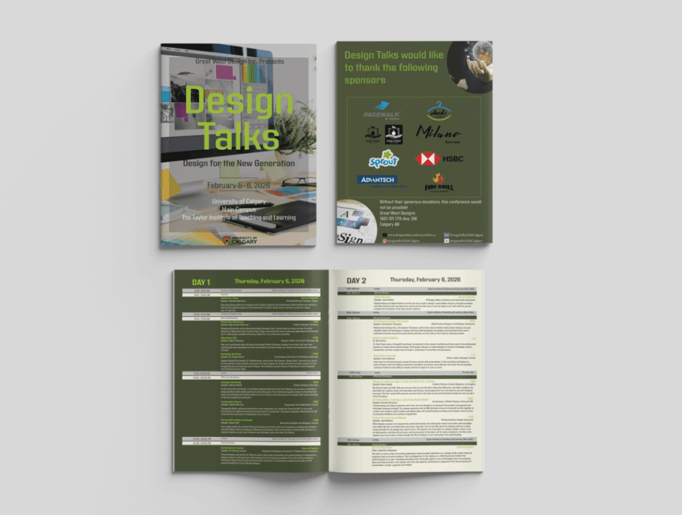
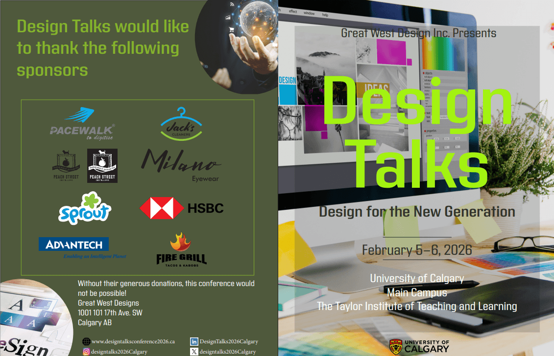
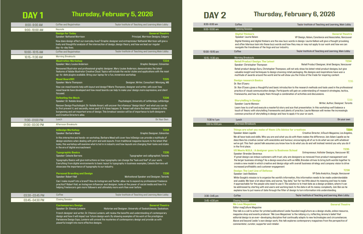
Design Talks was a layout design challenge with a very clear constraint too much information, only two pages, and everything had to look clean and professional. The problem was not what to design, but how to organise and prioritise content so a reader could move through it naturally without feeling overwhelmed. I started by going through all the event information and deciding what needed the most visual weight and what could be secondary. From there I worked on building a layout structure using a clear grid, strong visual hierarchy, and typography that would guide the eye from one section to the next without the page feeling cluttered. The toughest part was making two pages feel generous and spacious even with a lot of content packed in. I used whitespace intentionally, kept the colour palette minimal, and let the typography do most of the heavy lifting. Every design decision was about making the information easy to scan while keeping the overall look modern and consistent with a professional conference identity. The final result is a two-page conference layout that feels clean, organised, and easy to read everything in its right place, nothing fighting for attention.
Client
Academic Project
Year
2025
Platform
Print & Editorial
Timeline
1 day
Tools
Adobe InDesign